Jul 2025 - Aug 2025 · 1 Designers, 3 engineers · Toddle
75% of students were skipping assignment submission on Toddle, so we optimized the experience
Students were missing due dates, struggling to find where to submit, and skipping self-evaluations entirely. Teachers were routing around the product using portfolios and offline submissions just to get work done. We zoomed out, mapped the full submission journey, and redesigned it from the ground up across web and mobile.
What did we achieve?
NPS positive responses jumped from 32% to 87%, click efficiency improved by 70%, and support tickets for submission errors dropped to zero.
70% of interaction paths optimised across web and mobile
A click-by-click comparison of old and new flows showed friction reduced in over 70% of core use cases. Around 20% remained unchanged, and the 4% that increased in clicks was an intentional trade-off for clarity on mobile.
85% of students reported completing tasks faster in the new flow
Clearer navigation, a dedicated response section, and surfacing due dates and pending work upfront made the experience significantly faster and less overwhelming, especially for younger students.
Support tickets for submission errors dropped to zero
The "Mark as Done" error was one of the most common support issues before the redesign. Restructuring the submission flow to guide students step by step eliminated this entirely.
Students were missing due dates, skipping self-evaluations, and avoiding submission entirely
During conversations with students and teachers, and through NPS surveys and support tickets, we kept hearing the same things. Due dates were buried, the submission button required scrolling past walls of content, and self-evaluation lived in a completely separate section. Students weren't failing to submit because they didn't want to. The experience was simply not built for them.
The assignment page was cluttered, unstructured, and overwhelming, especially for younger students
Toddle's assignment experience had accumulated significant design debt. Instructions, due dates, evaluations, and resources all competed for attention with no clear hierarchy. On mobile, the Add Response button was so hard to find that teachers started using portfolios and offline submissions as workarounds. 75% of students were not submitting through Toddle at all.
So we rebuilt the full experience from the ground up
Rather than patching individual pain points, we mapped the full submission journey and redesigned it from scratch. A sticky response panel on desktop kept the submission box always visible. On mobile, a three-tab structure guided students through instructions, response, and review one step at a time. Self-evaluation was moved into the response section so it could no longer be skipped.
Project highlights
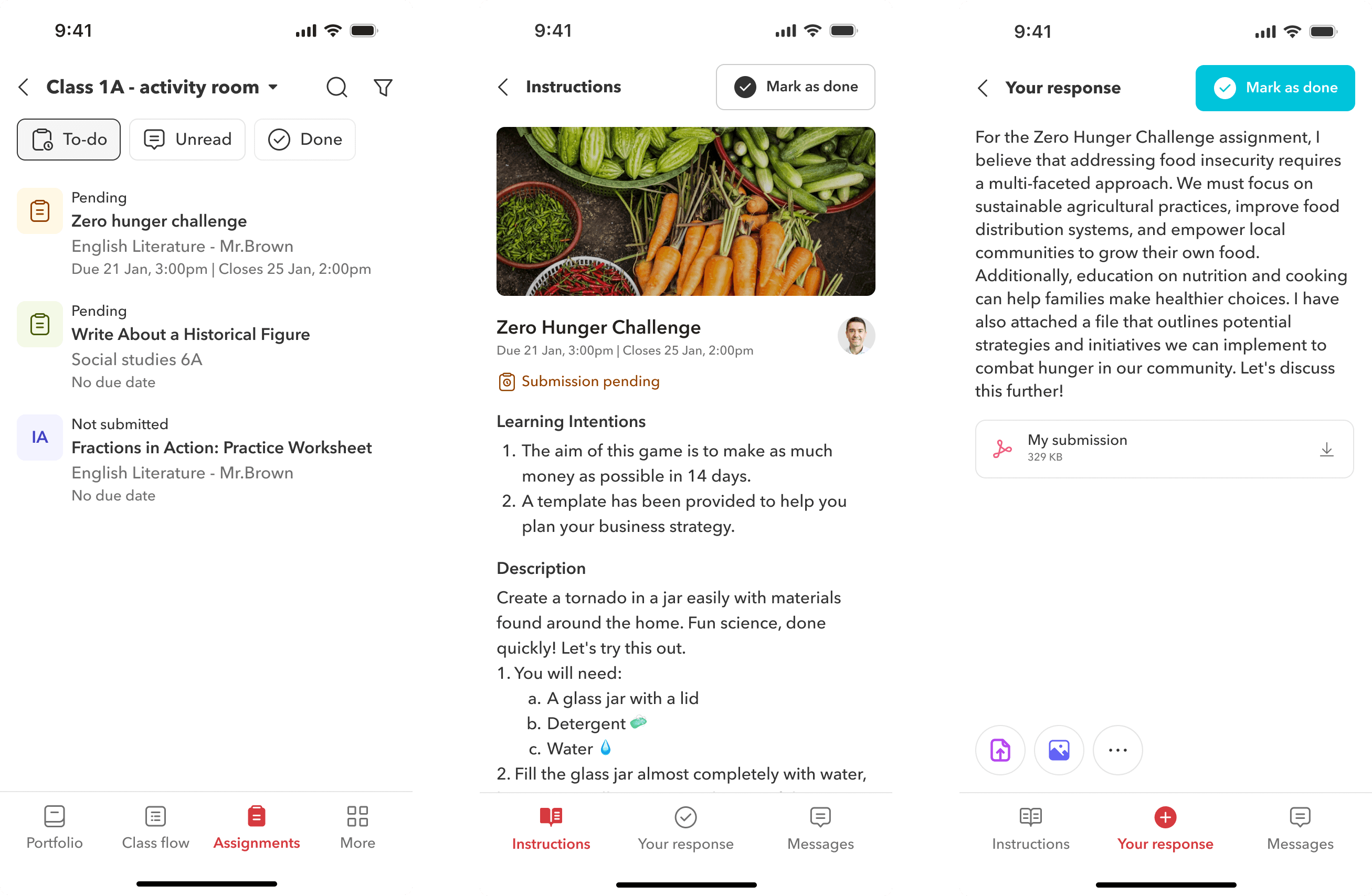
Step-by-step mobile flow
On mobile, the assignment experience is structured into three simple tabs at the bottom, guiding students through understanding the task, adding their response, and reviewing their submission, one step at a time.
Assignment widget and updated landing page for assignments
Enabled easier access to assignments through a redesigned assignment widget on web and tablet, supported by a robust notification system and an improved landing page that helps students quickly understand what’s due and where to begin.
Two page layout and enahnced visual design
The assignment page now uses a two-pane layout. On desktop, students can view assignment details on the left and upload their submissions on the right. The submission section stays visible while scrolling, so students never lose context.
PERSONAS
Understanding the problem space
As per our data 75% of the students were not comfortable submitting assignments through Toddle and due to this, teachers often ended up assigning offline and recording it online or using student portfolio space as a submission tool. As a result, students’ limited use of assignments made it difficult for Toddle to connect data across modules like the gradebook and progress reports.
The existing product, initially launched had fulfilled its foundational purpose. However, with time and user feedback, it became apparent that the product had accrued what we commonly refer to as "design and engineering debt." This debt comprises various aspects, including user experience challenges, navigation complexities, and the absence of a cohesive design language.
Navigation
The interface felt complex and unintuitive. Students often missed critical assignments because due dates weren’t clearly surfaced on the homepage.
Scrolling
Both on web and mobile, students had to scroll extensively to find the “Add Response” button. On smaller screens, this button was even harder to locate due to its low visual prominence
Lack of heirarchy
The assignment page was cluttered, with instructions, due dates, evaluations, and resources all competing for attention. There was no clear visual structure to guide students on what to do first.
Multiple submission areas
Students often missed adding self-evaluations because it lived in a separate area from the main submission section, leading to incomplete workflows.
PERSONAS
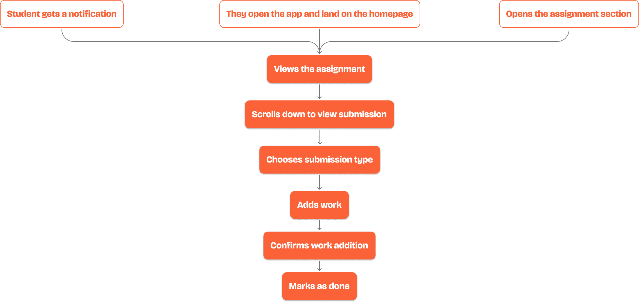
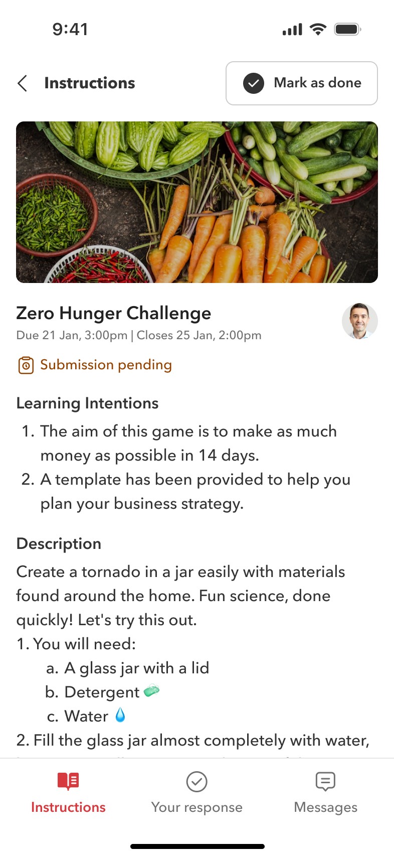
The current assignment submission process
Submitting an assignment as a student is a multi-step process, often cluttered with too much information upfront. Students struggle to distinguish what’s important; due dates, instructions, self-evaluations, and teacher feedback are not clearly visible or prioritized. On top of that, adding work involves multiple layers, which can feel overwhelming. Before diving into the case study, it's important to first visualize what the submission journey looks like from a student’s perspective.
PROBLEMS
Due dates were buried, submission steps were scattered, and self-evaluation was easy to miss
Due date and submission status were not in the same place, making it easy to miss deadlines. Adding work was buried deep in the interface, requiring unnecessary scrolling. On mobile, key actions like the Add Work button were hard to find, leading to incomplete submissions.
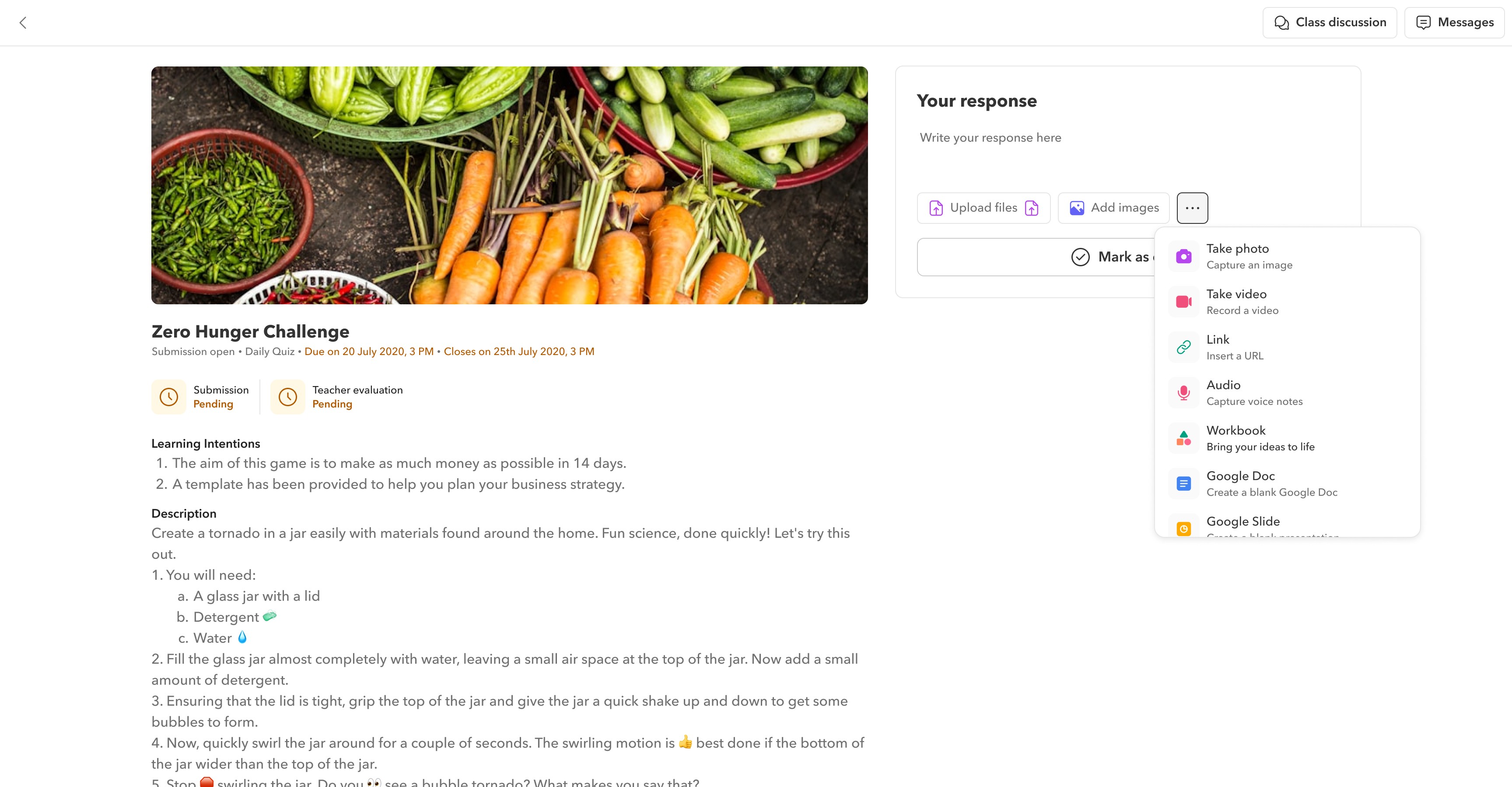
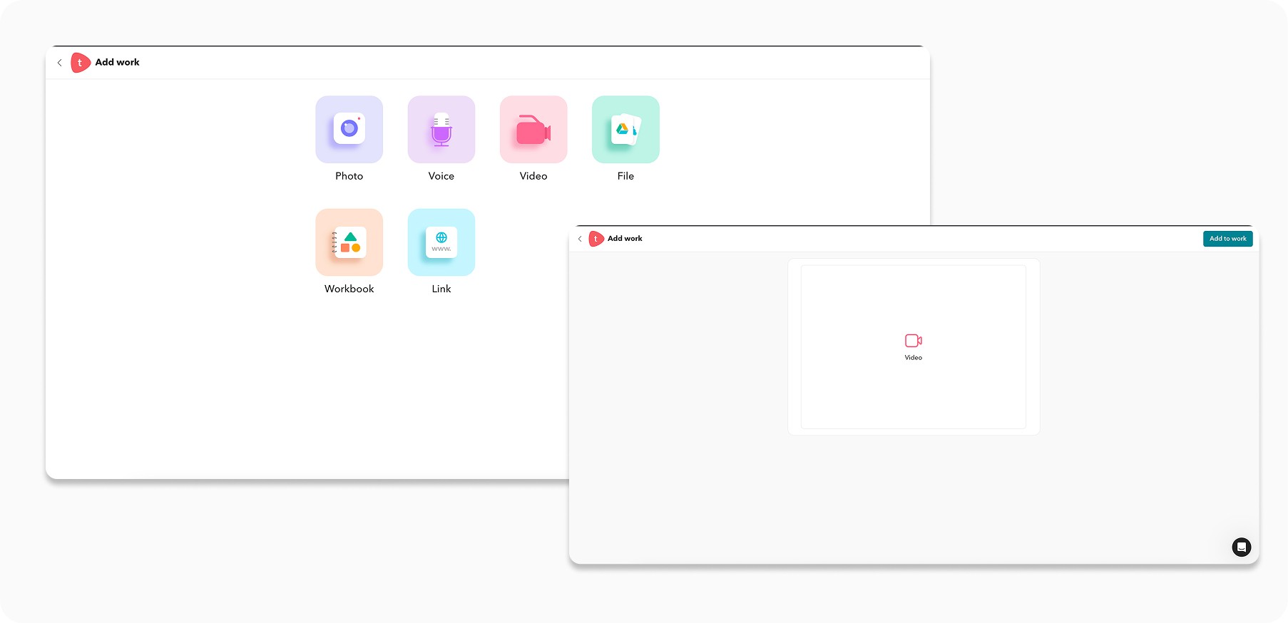
Too many media options upfront created decision fatigue and slowed down submissions
The Add Work screen presented too many media options at once, overwhelming students before they even started.
An extra confirmation step after selecting a file added unnecessary friction and increased cognitive load.
Submission status was unclear, self-evaluation was disconnected, and the iPad experience was hard to navigate
Students had to scroll down to check what they had submitted, often missing it entirely.
Self-evaluation lived in a separate section, and a pre-filled submission template was frequently deleted by students who did not realise its purpose.
The assignments widget only showed pending work, missing feedback, messages, and critical status updates
Students could not see new evaluations, feedback, or messages that needed their attention.
Feature updates like Close Date and Not Submitted statuses had made the existing assignment card design insufficient for displaying all necessary information.
PRINCIPLES
Making it simple but significant
The goal of the redesign was to simplify the experience by making a few high-impact changes, aiming for 80% of the impact with just 20% of the effort. We focused on identifying the most critical areas of friction and directing our efforts toward improving them.
As a designer, one of the biggest challenges was streamlining the overwhelming amount of information users needed to see on their screen, without compromising on clarity or usability. The focus was to make the assignment viewing experience simpler, more accessible, and genuinely delightful for every individual.
Before moving into visual design, I defined a few core conditions to guide an efficient user flow, ensuring that the redesign would not just look better, but feel better to use.
Navigation
It must feel effortless and intuitive, enabling students to focus on learning instead of figuring out how to use the platformw
Scrolling
The experience must minimize friction - fewer clicks, faster access to key actions, and clear guidance at every step.
Lack of heirarchy
The design must build confidence, making students feel empowered, in control, and supported throughout their journey
PROCESS
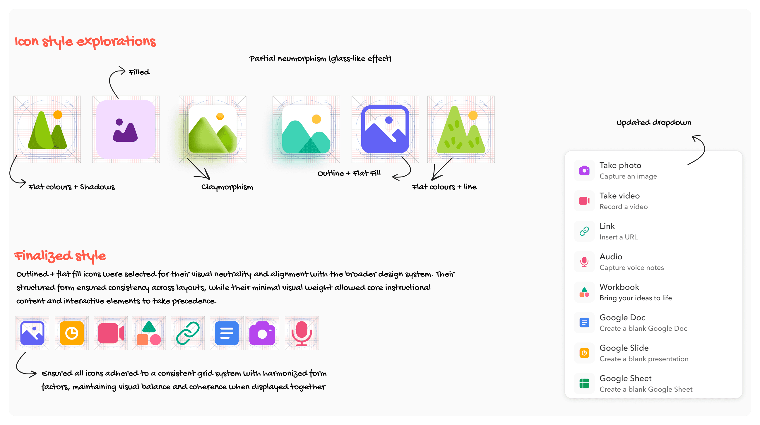
We turned research into iterations, testing layout approaches, icon systems, and submission flows
For brevity and confidentiality, I have outlined only a few key approaches here. We tested these internally through Figma voting and direct feedback sessions with teachers, focusing on how to better organise and chunk information for students.
Turned insights to actions
We took some data on the types of media files added by students and found that 80 percent of this was images and files uploaded from device.
A/B testing with users
Gathered detailed requirements directly from partner schools and built interactive demos to validate direction and gather feedback.
Collaborated with developers
Worked closely with engineering teams to evaluate feasibility, identify edge cases, and co-create a realistic development road
Reiteration and refinement
Improved designs through continuous feedback loops — ran regular cadence calls to resolve dependencies, address developer questions, and adapt to evolving constraints.
Simplifying the media upload experience by reducing options and improving icon clarity
80% of student uploads were images and files from device. We tested multiple icon styles and landed on outlined icons on a consistent grid, reducing visual noise. The dropdown was reorganised to group options clearly and cut decision fatigue.
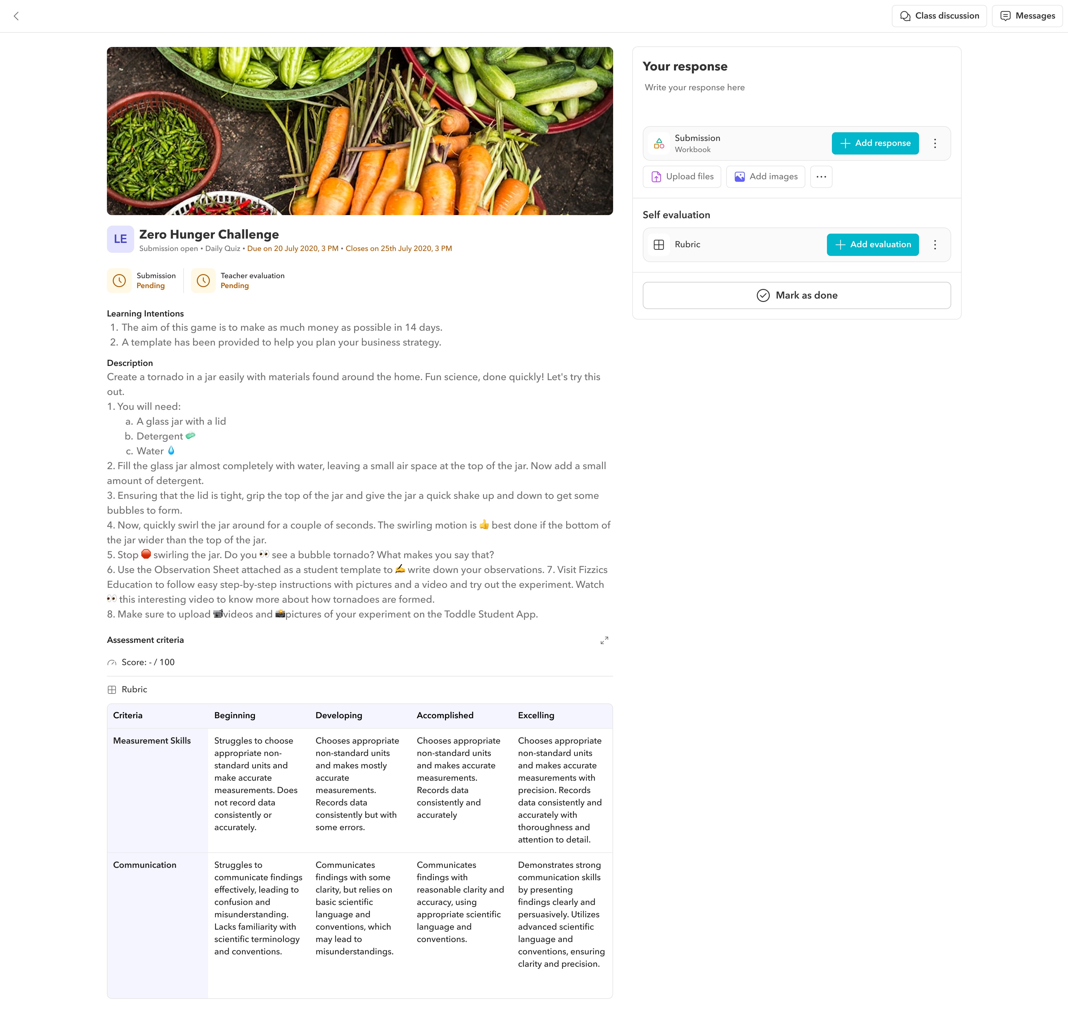
Redesigning the desktop layout to keep submission always visible and in context
We split the assignment page into two areas: details on the left, sticky response panel on the right. The Mark as Done button was locked until both a file and self-evaluation were completed, preventing incomplete submissions.
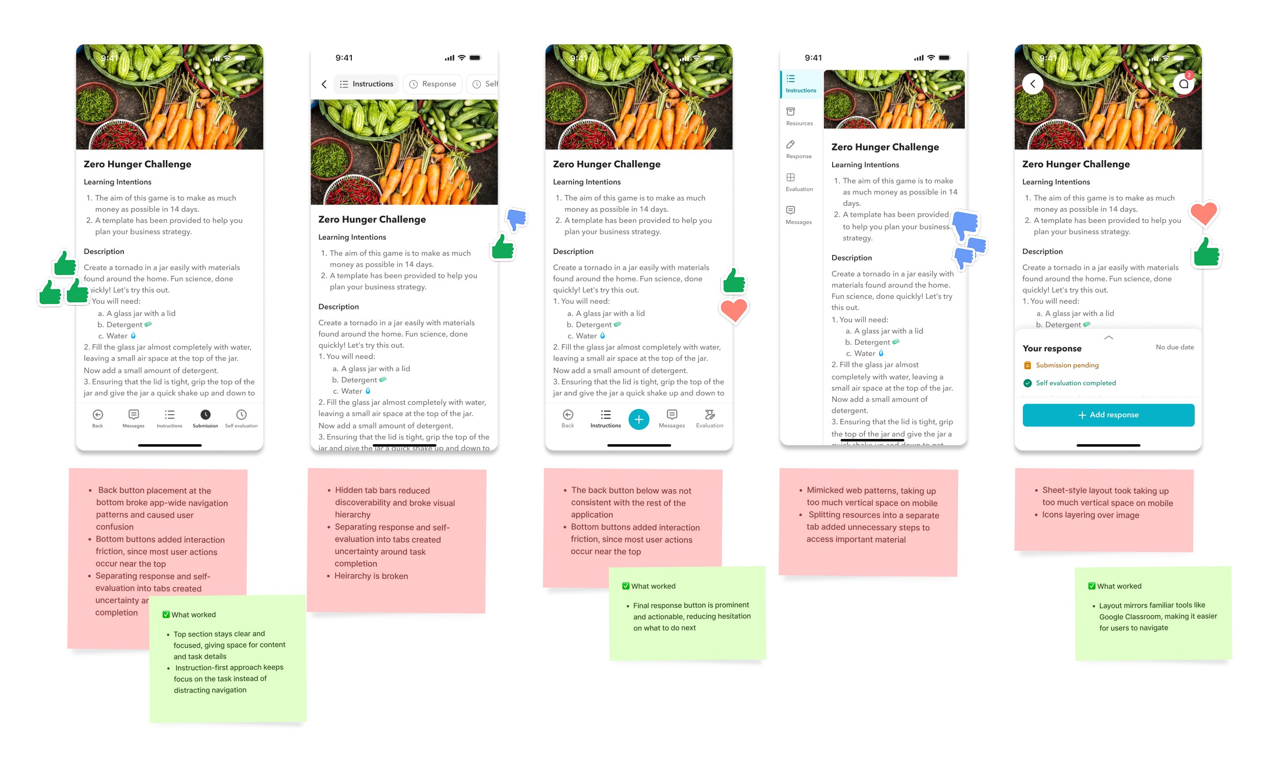
We explored four mobile navigation patterns to find what guided students best through the assignment flow
We created multiple options and voted on them in Figma with the team. The winning direction used a top tab layout with clear sections for instructions, response, and self-evaluation, keeping focus on the task and reducing navigational distraction.
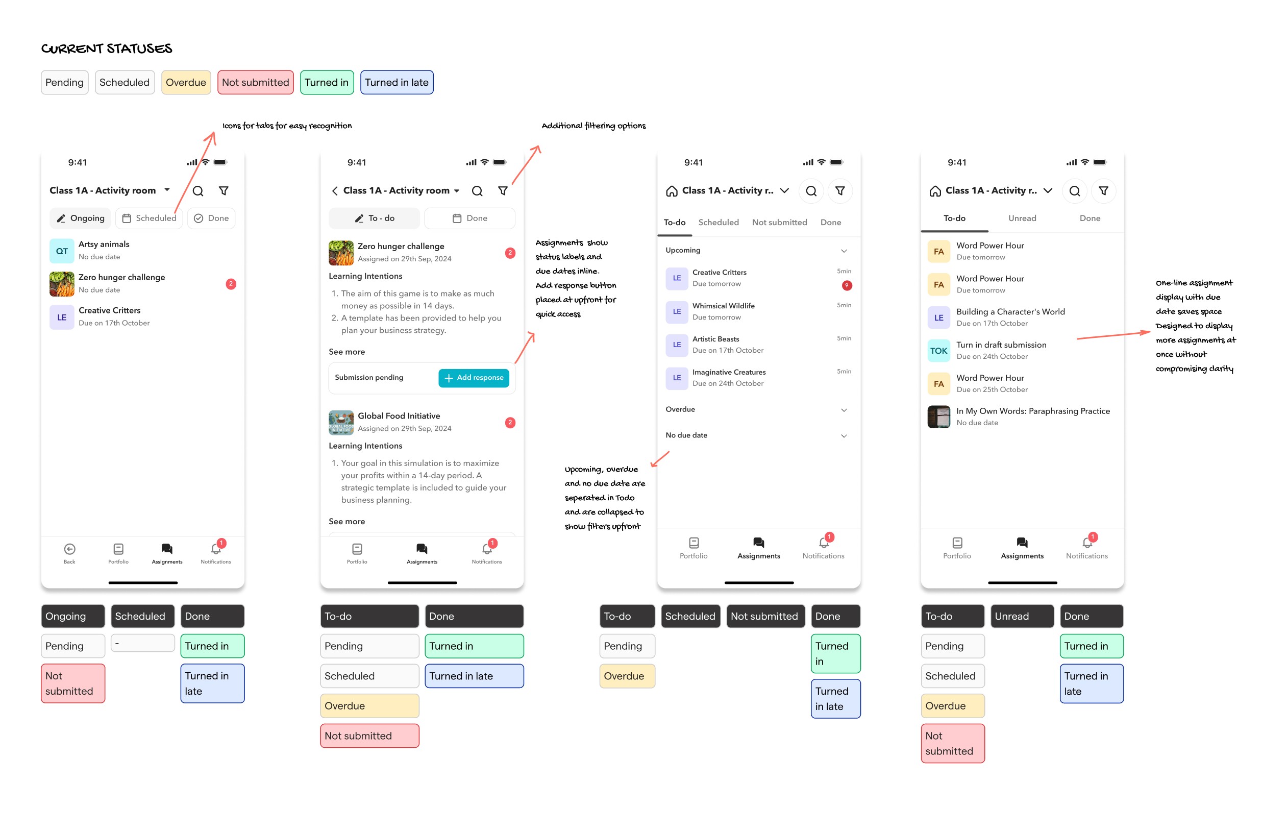
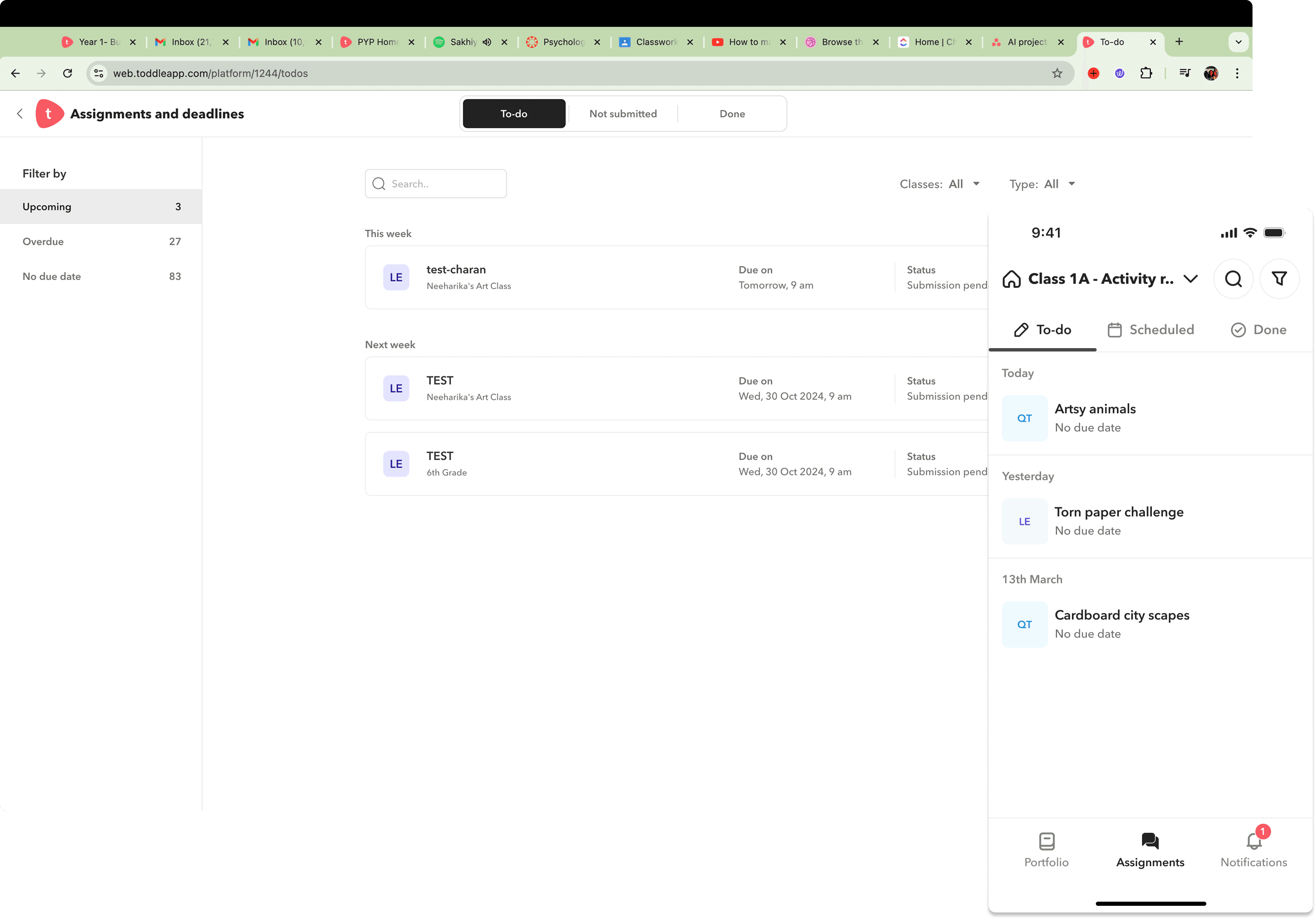
We redesigned the mobile landing page to surface overdue work and unread messages upfront
We tested different status groupings, moving from Ongoing, Scheduled, and Done to a clearer To-do, Unread, and Done structure. Overdue and Not Submitted statuses were given more prominence, with both bottom and top tab navigation explored before landing on the final approach.
THE SOLUTION
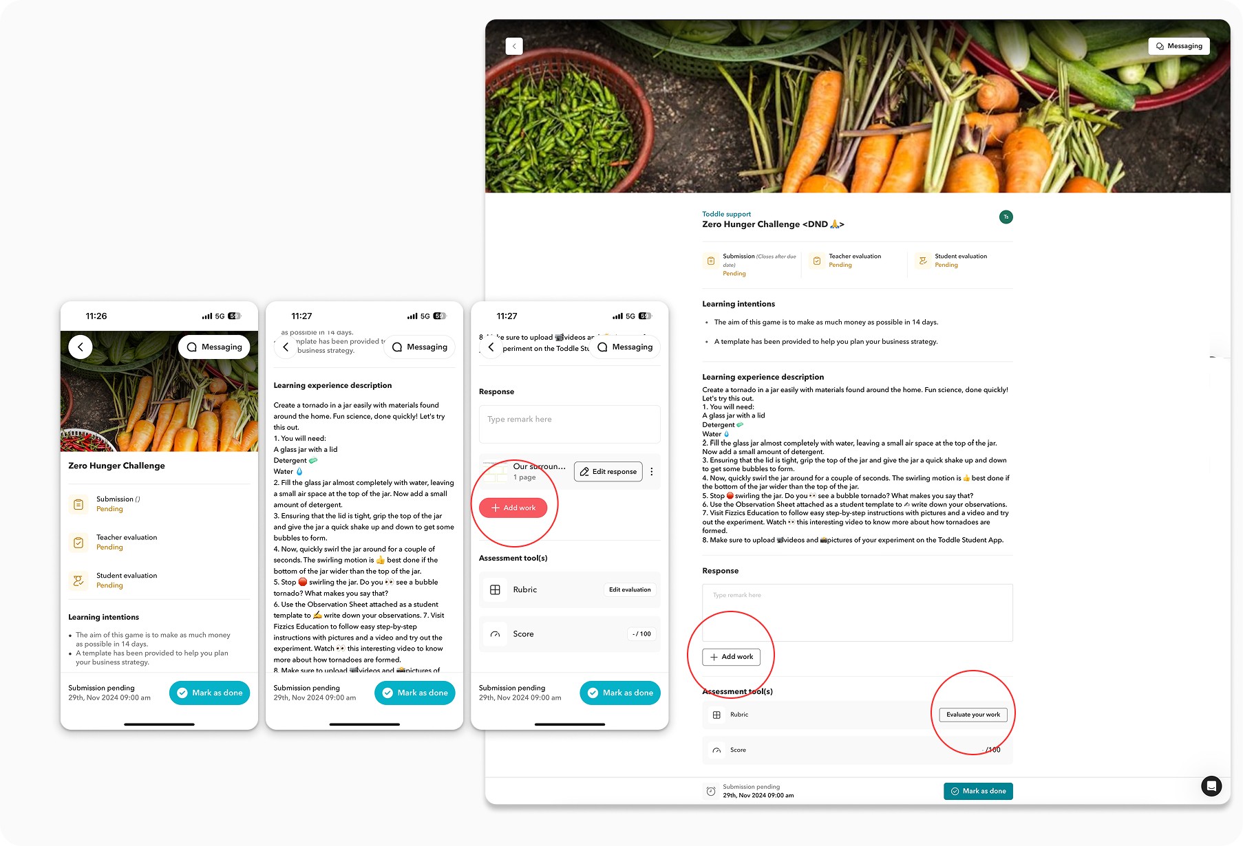
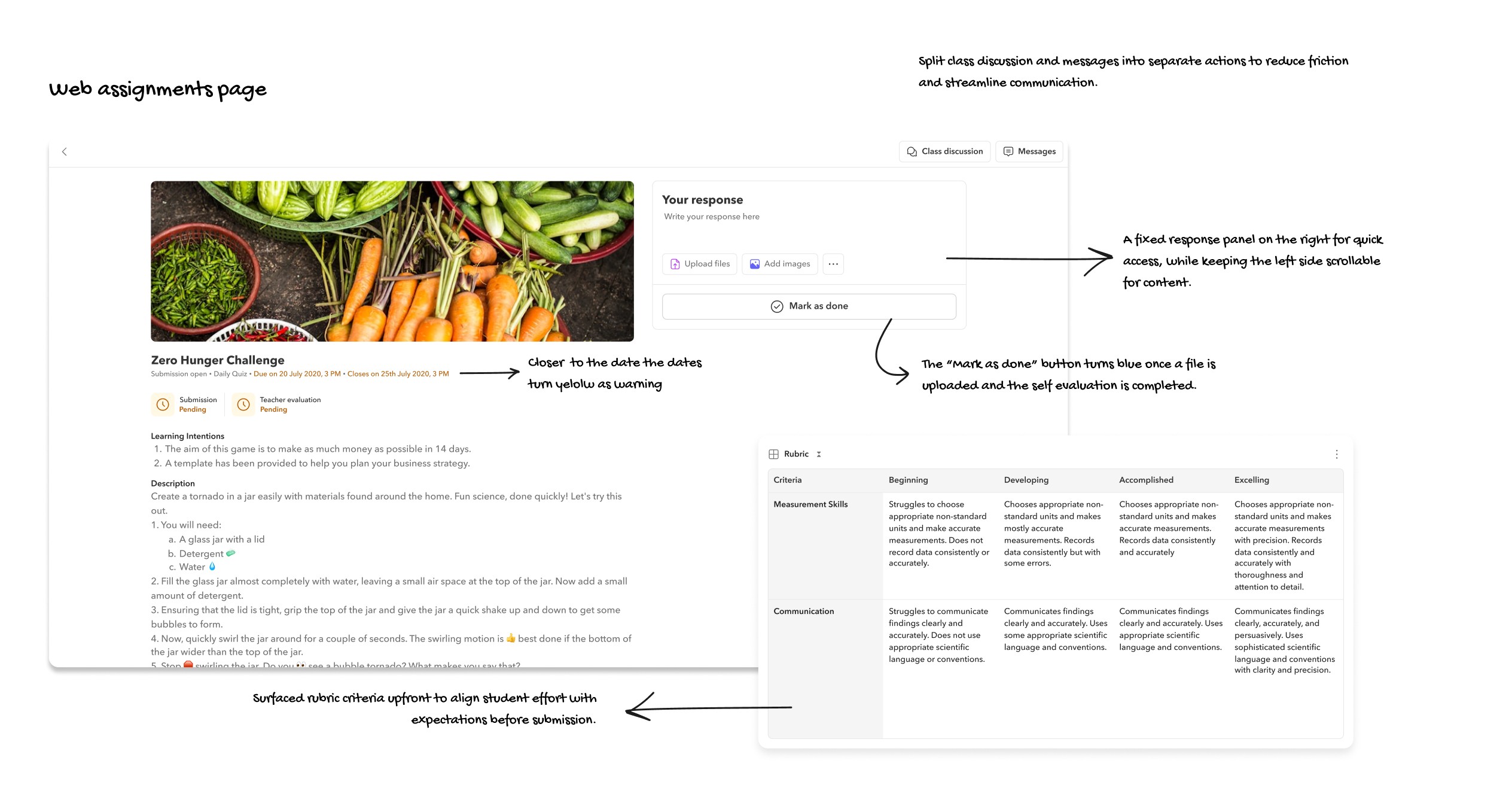
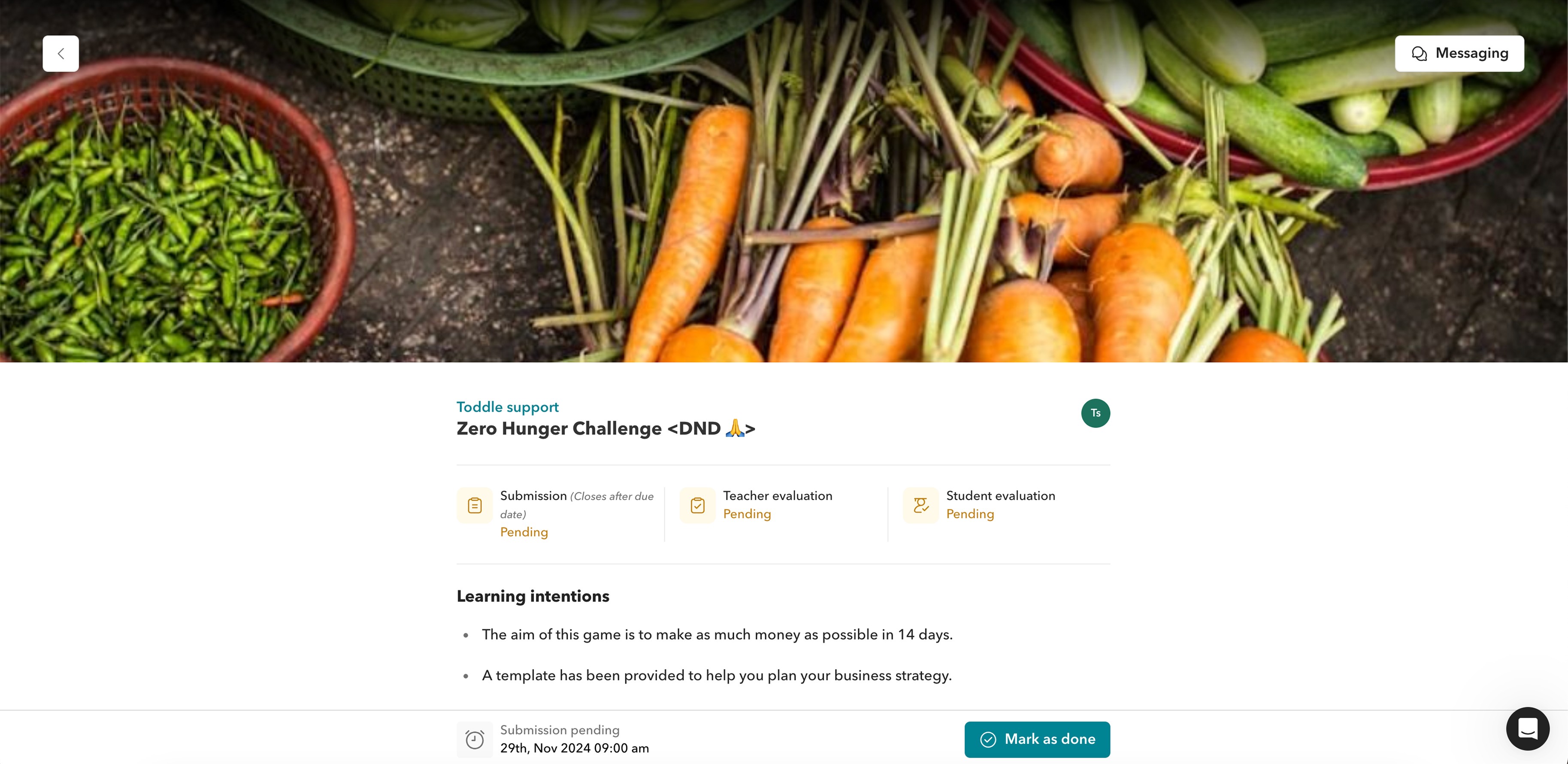
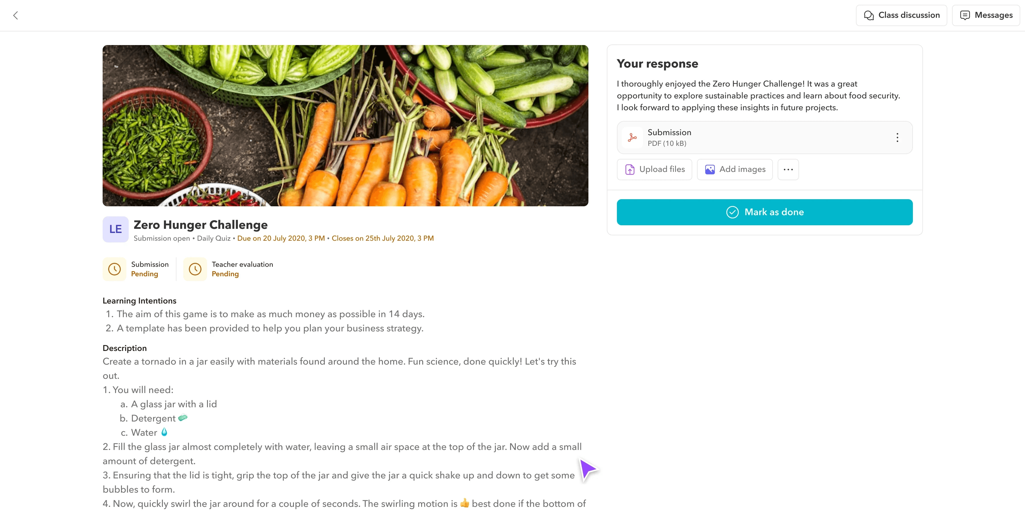
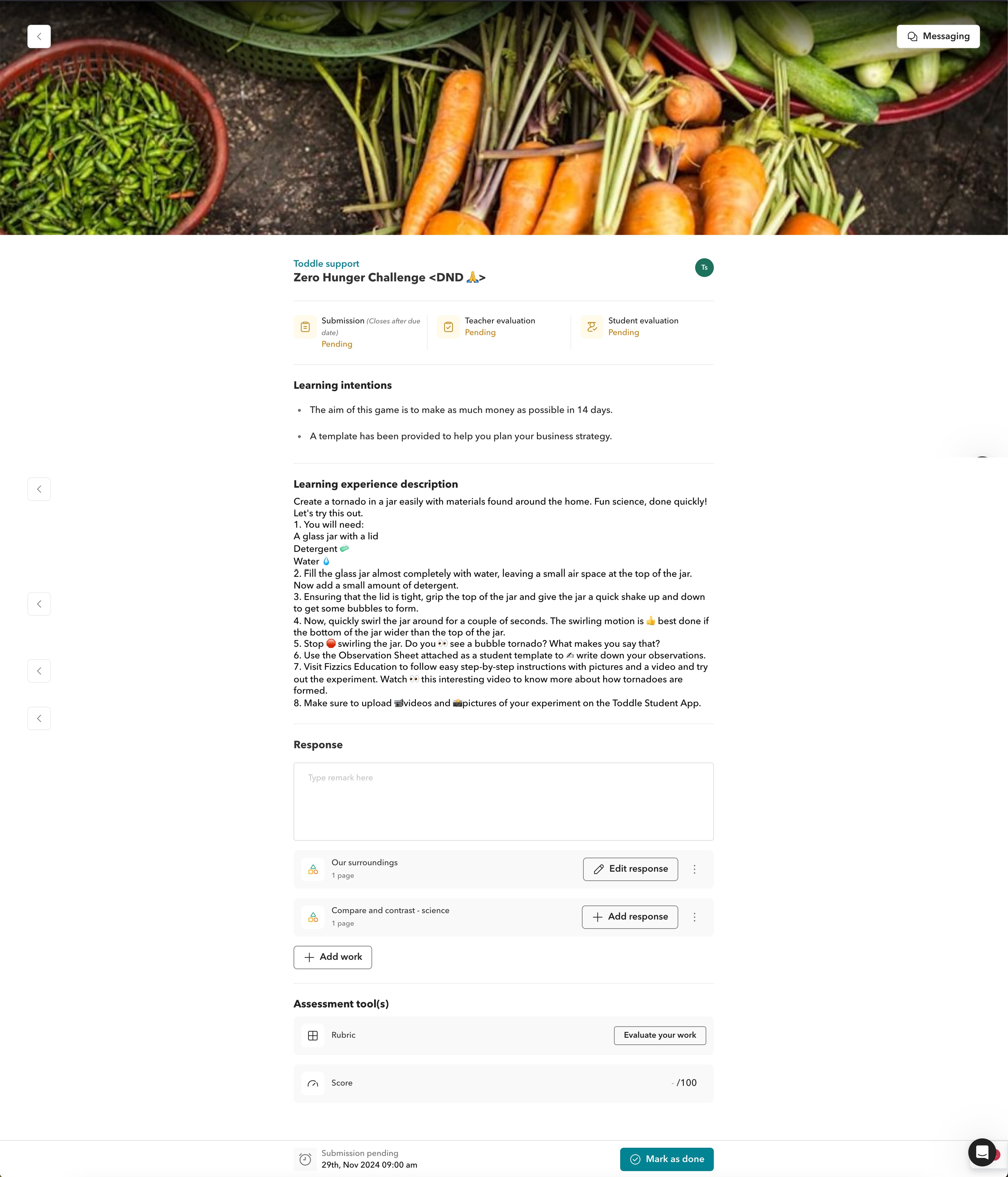
Redesigning the desktop assignment page with a two-pane layout and guided submission flow
Key details are shown on the left while a sticky response box stays visible on the right. The Mark as Done action only unlocks after the student uploads their work and completes the self-evaluation, creating a structured workflow that prevents incomplete submissions.
Two-pane layout with a guided submission flow
The layout features a two-page view: key details like the learning experience description, assessment tools, submission status, title, and important dates (open, close, due) are shown upfront, while the right side hosts a sticky response box.
The submission box is designed to unlock the "Mark as Done" action only after the student uploads their work and completes the self-evaluation, ensuring a guided and structured workflow.
Assessment tools are placed upfront, helping students clearly understand expectations before they begin working.
New teacher messages appear directly in the chat sidebar, keeping communication clear and visible throughout the process.
Submission statuses are clear with a due and close date in yellow when due date is nearing.
Before
After
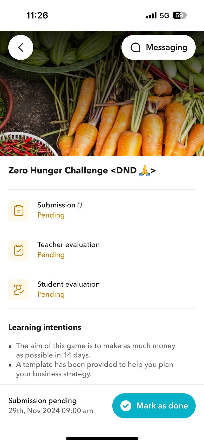
Rebuilding the mobile assignment flow into clear step-by-step sections with a revamped landing page
The mobile flow was restructured into three sections: instructions, your response, and messages. Evaluation tools follow an expand-collapse interaction, and the landing page was revamped to prominently surface pending work and unread messages.
Step-by-step mobile flow with a revamped landing page
The mobile flow was redesigned into clear, step-by-step sections: instructions, your response, and messages - creating a more guided experience for students.
The UI was made more compact, allowing more information to be visible at once without overwhelming the user.
Evaluation tools were updated to follow an expand-collapse interaction. One criterion opens at a time, and once completed, it automatically collapses, bringing focus to the next.
The mobile landing page was revamped to prominently feature pending work and unread messages, with filters to easily toggle between pending and completed tasks.
Before
After
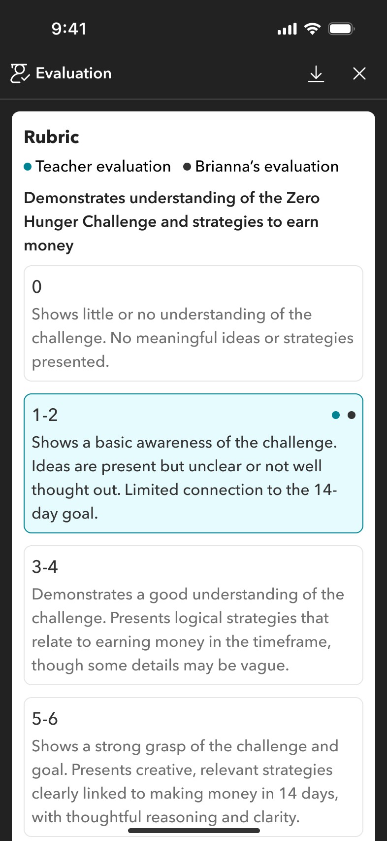
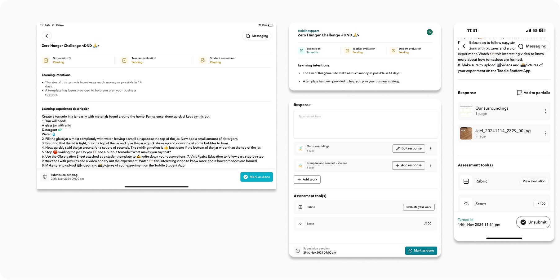
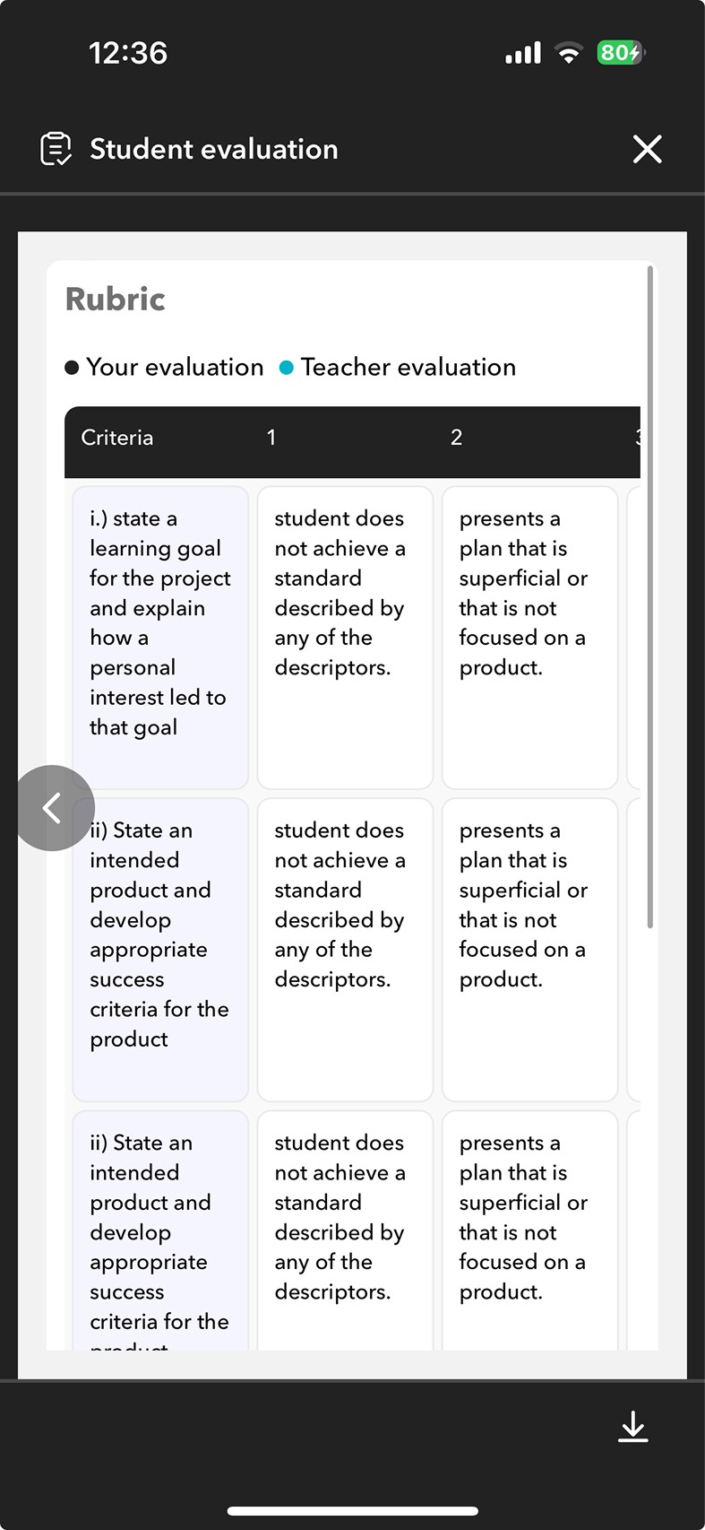
Moving self-evaluation into the response section so students could no longer skip it
Self-evaluation was added directly into the response section, with buttons becoming outlined once a response was added to indicate the correct order. The submission template was also moved here and clearly marked, making adding a response the primary action.
Self-evaluation moved into the response section
We added self evalution in the response section so students wouldnt end up missing it. the buttons would also become outlined onvce the response has been added, indicating to students what order they should be adding their resposne in
Submission template added by the teacher is also added int he response section and clearly indicated that that is a submission template with adding response being the primary action, not adding work - indicated through colours
Before
After
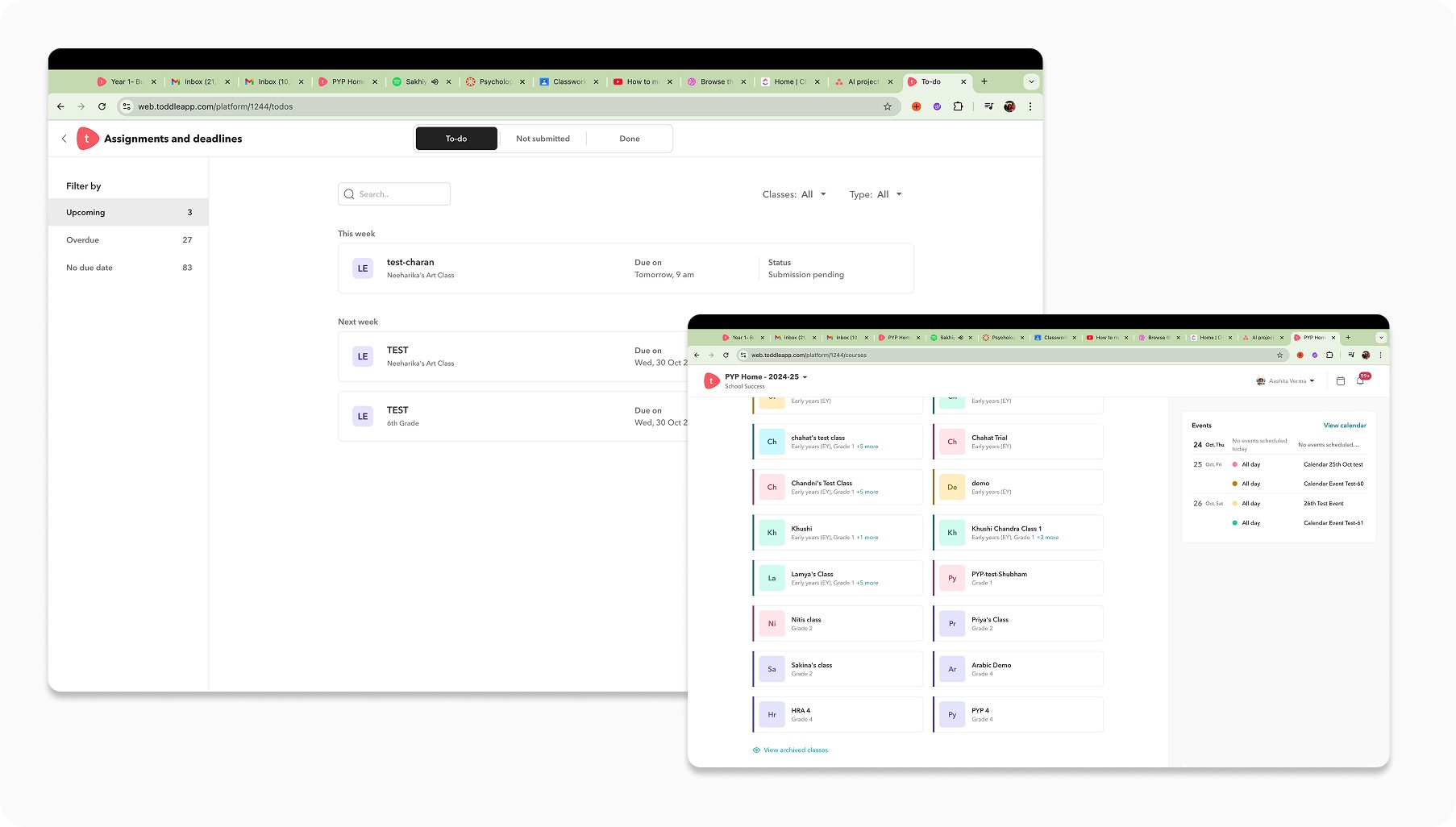
Rethinking the assignments landing page with action-oriented tabs and a customisable homepage widget
We introduced To-do, Unread, and Done tabs, moving less-used filters out of the main view to reduce cognitive load. We also built a customisable homepage widget surfacing only the most essential details: assignment name, status, and teacher comments.
Homepage widget
Mobile assignments page
Action-oriented tabs and a customisable homepage widget
We rethought the student task experience from the ground up and introduced two action-oriented tabs — To-do and Unread, with Done for completed tasks.
Less frequently used tabs were moved under a filter to reduce cognitive load, with the option to use chips for deeper filtering if needed.
We also translated this structure into a customizable homepage widget on the student web dashboard, giving students quick access to what matters most.
The content within the widget was intentionally minimal, surfacing only the most essential details; assignment name, status, and teacher comments to support fast, informed action.
Before
After
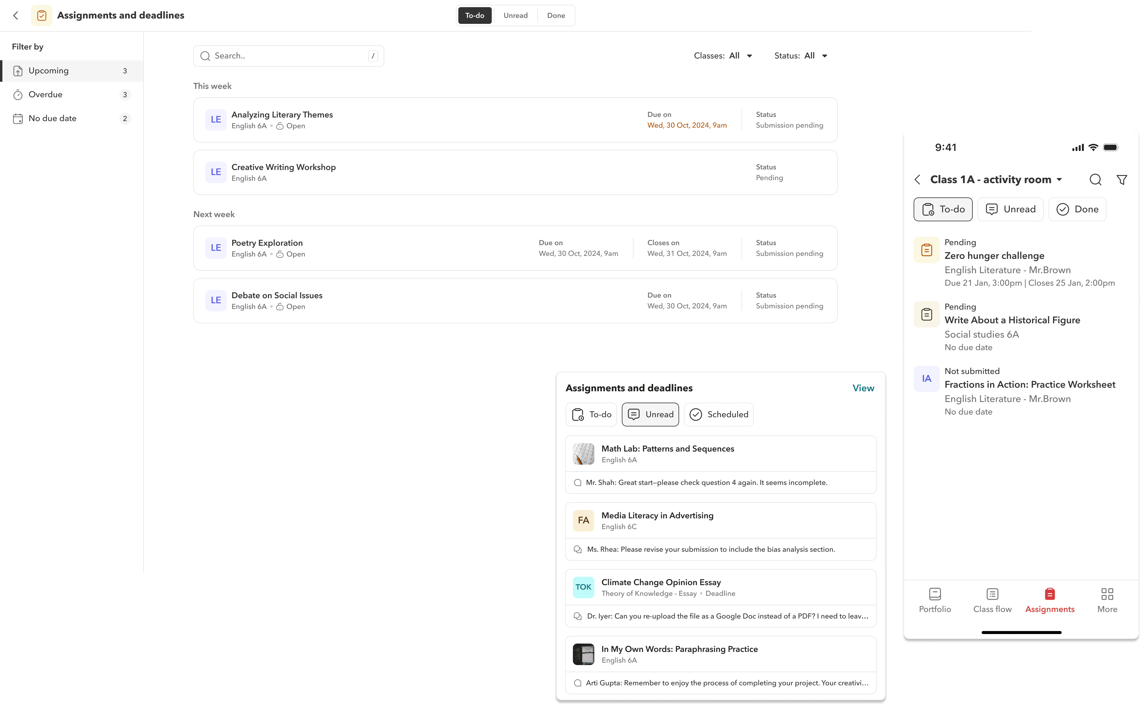
…We also created product illustrations for students for all submission states and actions
Designing a consistent illustration system to support every submission state
We defined a distinct visual style for the illustration system, extending beyond empty states to cover every possible submission scenario students might encounter.
Each illustration was paired with clear, friendly microcopy to guide students on what to do next, reducing confusion at critical moments in the flow.
States covered include submissions closed, no files submitted, submission not required, ready to start, submitted successfully, and scheduled assignments.
IMPACT
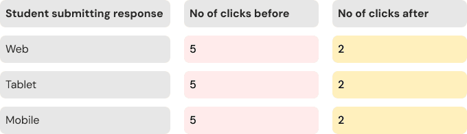
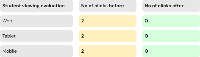
Reduce no of clicks in the new flow
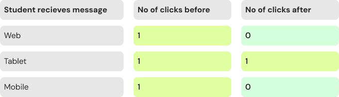
We conducted a click-by-click comparative analysis of the old and new flows to evaluate usability gains. The results showed that we had optimized interaction paths in over 70% of core use cases, reducing friction and improving task completion speed. Around 20% remained unchanged, while 4% saw an increase in clicks, primarily due to introducing a dedicated response tab on mobile. This trade-off was intentional, prioritizing clarity and focus by offering a clean, separated view tailored to smaller screens.
IMPACT
Let's talk numbers
The redesign delivered measurable results across every metric we tracked. Students were faster, more confident, and no longer hitting dead ends in the submission flow.
85%
Students completing tasks faster
85% of students reported completing assignments faster in the new flow.
70%
Click effeciency improvement
70% of interaction paths were optimised, reducing friction across web and mobile.
100%
Student task completion confidence
100% of students in testing said they felt more comfortable and clear on what to do.
0
Submission ticket errors
Support tickets for Mark as Done errors dropped to zero after the flow was restructured.
REFLECTION
Reflecting on this
Many layout and usability flaws were uncovered only because we tested often and involved real users. Failing early through rapid iteration ultimately made the final product much stronger.
This project started off looking simple but revealed complex and layered needs as we dug deeper. Many issues were not captured directly in feature requests or NPS feedback. For example, teachers were using portfolios to manage assignments, which was never the intended flow. This taught me that valuable patterns are often hidden beneath surface level asks, and user behavior needs to be interpreted, not just reported.
Initially, illustrations were not a priority, but the work evolved into its own design track. We had to define a distinct visual style that extended beyond empty states. This expanded my appreciation for how illustration systems support the overall experience.
Our click by click comparison between old and new flows helped align stakeholders. It highlighted real improvements and helped justify decisions with clear and measurable data.
I also enjoyed focusing on the smaller details; icons, visual balance, and interface behaviour. These small but intentional changes helped bring clarity and cohesion to the final product.


